notification centre says no events BUT WHAT ABOUT ALL DAY EVENTS?

7.1 still sucks ass.


The notification centre doesn’t include all day events or tomorrows events (aside for an essay about tomorrow having 3 things to do opposed to iOS 6 telling you what is upcoming in simple bullet points)

All it says for me is ‘NO EVENTS’

Well Apple, how about my all day event????


Screen Shot 2014-04-10 at 06.23.57 pm

iOS 8 going back to

http://www.macrumors.com/2014/03/14/ios-8-game-center-notifications/

[I]Apple may be simplifying existing apps like Notification Center, doing away with the “All” and “Missed” views and combing them into one “Notifications” view. The new Notification Center will contain “Today” and “Notifications” views, making it easier for users to keep track of items that are immediately important. Voice Memos also will see a redesign with controls that distinguish between recording and playback functions.

[/I]

So they are going to make iOS 7 like iOS6 and do away with the complications that iOS 7 brought? Good. This is what I said when iOS 7 first came out https://thingswrongwithios7.wordpress.com/2013/06/13/no-more-icons-just-text-to-make-things-harder-to-read-at-a-glance/

7.1 and smaller contact pictures misuse of space and impacts visually impaired users

7.1 lands and we have roundness everywhere. See this post https://thingswrongwithios7.wordpress.com/2014/01/17/sick-of-ios-7-roundness-bring-back-a-square-look/

Now the caller screen has these stupid round cut of pictures that are TINY! I use to use those pictures for menus for take outs or to actually see someone. Now the picture is so tiny, it’s pointless looking at. I’m glancing who the hell is that… what a misuse of space again apple. So much white space and misuse of it.

This is is the rubbish we have now

Before we had beautiful big pictures.

What do you like more?

P.S.

Apple really focused on the accessibility features of 7.1 but at the same time they screwed people that rely on big pictures to see who the are talking to

A forum member writes on the discussion board

Am visually impaired and having the large photo on caller ID was great I could see who was calling at a quick glance. Now I have to bring phone all the way up to face to see who is calling.

Nice job apple.

Send them this link via this page http://www.apple.com/feedback/
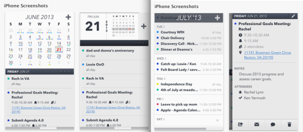
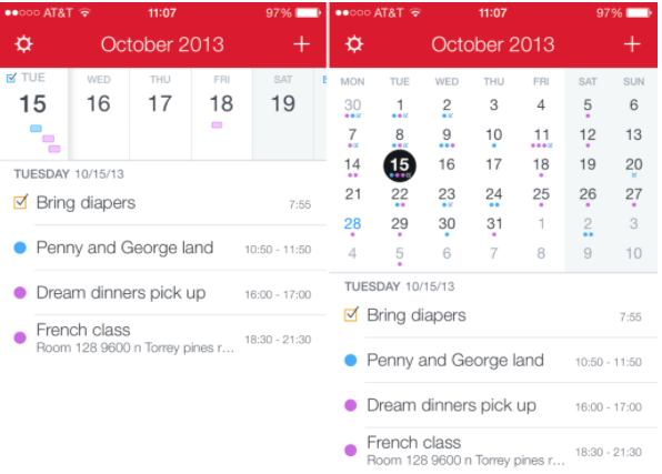
Sick of iOS 7 roundness…bring back a square look

My biggest peeve with iOS 7 is that everything is round. I’d much prefer a square look. I’d like square edges, professional feel. Not beach balls round and bubble writing. Give me square and straight. It makes iOS 7 look soft

They should include  a toggle:

Do you want to remove the round corners and round buttons and replace them with squares?

See my post on how the round contact pictures actually remove the content of the image and you end up seeing less with baby circles.

MarkAsReadDelay Removed by Apple for Mac Mail

I used to use http://christianserving.org TruePreview to have mail automatically marked as unread until I want to mark is as read. Try navigating around your email box and you find you accidentally click mails as read all the time and miss important stuff. After True Preview not working I found that the Apple Engineering team removed a key feature in 10.9

MarkAsReadDelay

We can petition to get it back!

File a bug report at https://bugreport.apple.com

and http://www.apple.com/feedback/macosx.html


Apple banns gold/red/green/yellow iPhone colours because they look like kids toys?

I already have moaned how Apple are targeting under 12’s with their dumbed down iOS 7 with removed features and bright sickly colours. Apple have  now updated their marketing material to say no hip hop video gold, Apple red, neon 1980s slimer green and lemon yellow iPhones allowed.

https://developer.apple.com/app-store/marketing/guidelines/#images

Source http://www.idownloadblog.com/2013/10/31/apple-bars-goldredgreenyellow-device-shots-from-devs-marketing-materials/


Designer David Yun thinks IOS 7 is poo

http://www.forbes.com/sites/berlinschoolofcreativeleadership/2013/10/15/interview-designer-david-yun-on-the-pros-and-cons-of-apples-ios-7/

It has a lot less to do with the design community and more to do with the constant drive to sell new products,” Yun explained. “That said, the intention of iOS 7 is completely valid. It’s the execution and the qualities of that execution that are in question. Here’s hoping for a closer look at those qualities in iOS 7.1!”

The problem is that while they successfully removed (most of) the skeuomorphic approach, they didn’t replace it with a design perspective that solidly situates it as Apple and not any of the other players. In doing so, they’ve degraded one of their best assets: having an interface which is uniquely, solely, unmistakably Apple. We’re left with an interface that’s Apple-ish but could easily be mistaken as Google-ish


Unless Apple finds a way to clearly define the iOS and reclaim their Apple-ness, it strikes me that there’s now an open playing field for other contenders to make a stronger interface design

Alternatives to iOS 7 Calendar – Apps

Miss the iOS 6 calendar? Dismayed at the Apple crappy form over function in the new iOS 7 Calendar? Try these apps. They restore the ‘quick glance’ overview Ive took away in iOS 7. Some apps have a good week overview, some have the preview pane ala iOS 6 and a lot of apps don’t have the stupid scrolling up and down that iOS 7 has which makes it a pain in the ass to plan anything with the calendar app. Click the links below to get a closer look at these apps

Calendars 5 by Readdle

Agenda Calendar 4

thingswrong_ios7calendar

Fantastical

Fantastical 2

Screen Shot 2013-10-30 at 13.31.02 Screen Shot 2013-10-30 at 13.30.53

CALENGOO

WEEKCAL

weekcal